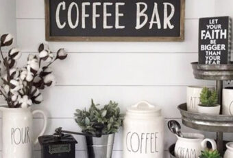
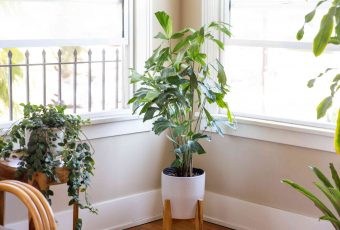
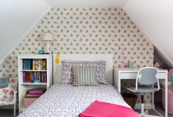
In the midst of the pandemic, everyone’s lives have been completely upended, and the way we spend time at home was completely redefined. Kitchens have doubled up as offices, living rooms became the new classrooms, and many of us starting spending more time in our bedrooms than ever before. It’s safe to say that most of us have spent the most time at home than ever before.
Pantone Color Of The Year
For that reason, Pantone has used its annual tradition of announcing the color of the year as an opportunity to give us all some levity and a sense of lightness after so much heaviness that bombarded us for so long.
In breaking with its usual tradition, Pantone announced not one but two colors: PANTONE 17-5104 Ultimate Gray and PANTONE 13-0647 Illuminating. Though the colors seem completely opposite, they complement one another and aim to represent “strength” and “optimism” and the balance between the two.
Executive Director of the Pantone Color Institute Leatrice Eiseman shared in a press release: “The selection of two independent colors highlight how different elements come together to express a message of strength and hopefulness that is both enduring and uplifting, conveying the idea that it’s not about one color or one person, it’s about more than one.”
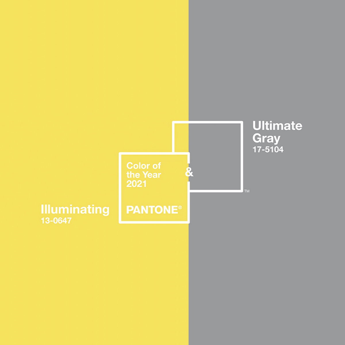
Pantone Announced Two Colors Instead Of One
When it came to selecting the colors, the Pantone Color Institute Team knew that gray is a neutral that is already quite popular around people’s homes. Eiseman said: “Ultimate Gray was that feeling of strength, something that’s enduring, rock solid, resilient, thoughtful. With gray, people will always connect those words.”
Illuminating is a light and bright yellow which is meant to symbolize optimism. Eiseman said the color as a “sunshine” that can bring “cheer, positivity, and gratitude” during these especially trying times. She also said it is an innovative color.
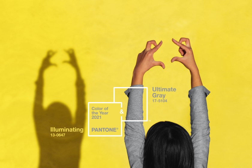
The Two Colors Balance One Another
Eiseman said: “Practical and rock solid but at the same time warming and optimistic, this is a color combination that gives us resilience and hope. We need to feel encouraged and uplifted, this is essential to the human spirit.”
The two colors together represent the idea that together we are all stronger, a sentiment that can help us as we try to navigate out of the extraordinarily tough and unusual times that we have all been experiencing.


